Client BORG Monsberger
Year 2023
Services Brand Design, Motion
BORG Monsberger is a public high school in Graz that offers students a unique range of study paths. We created a clean, friendly identity that balances individuality with a strong sense of community.


Starting point
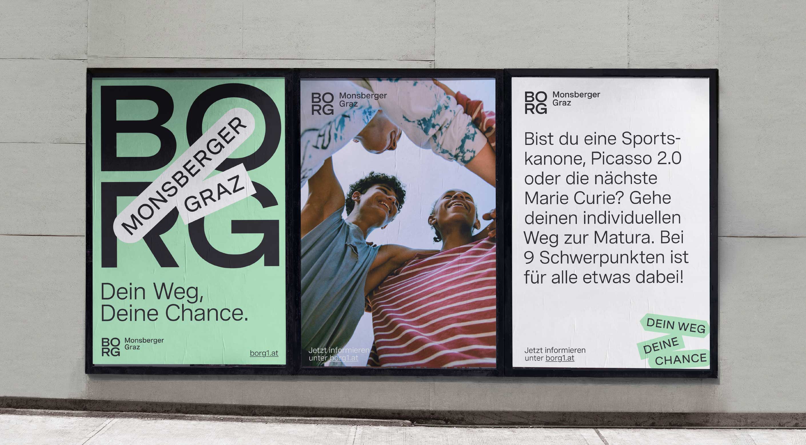
Every student at BORG Monsberger follows their own path to graduation, choosing from a variety of focus areas to build on their strengths. Over the years, separate designs for each area led to a fragmented and inconsistent image. The challenge was to create a cohesive brand system that unifies all study areas while still leaving room for individuality and future growth.
The idea
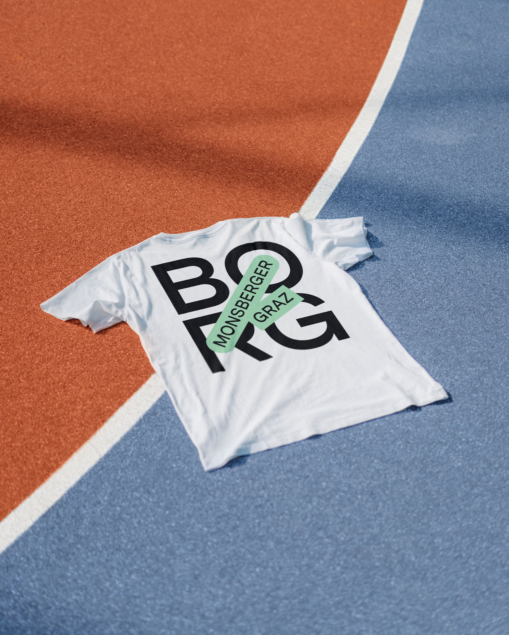
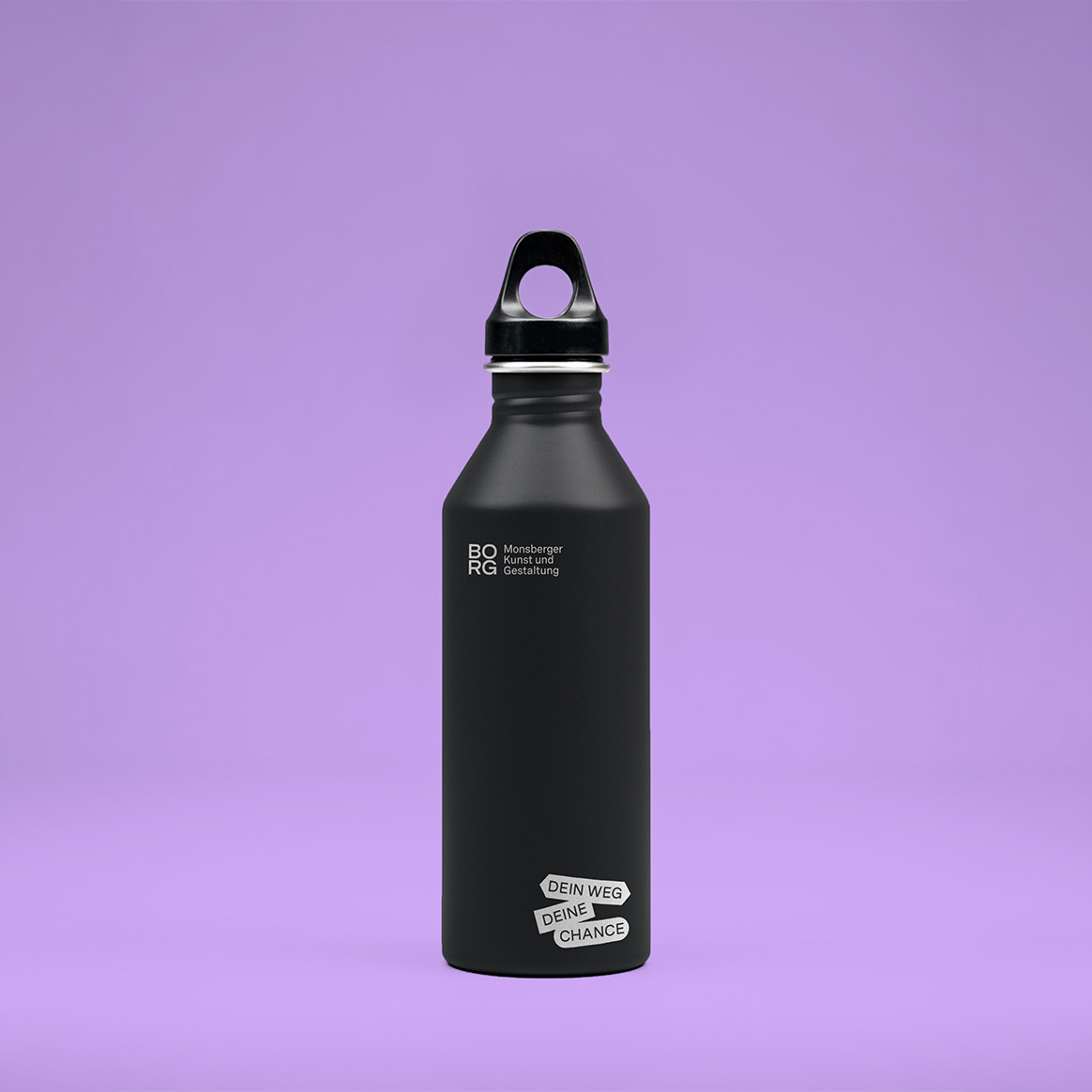
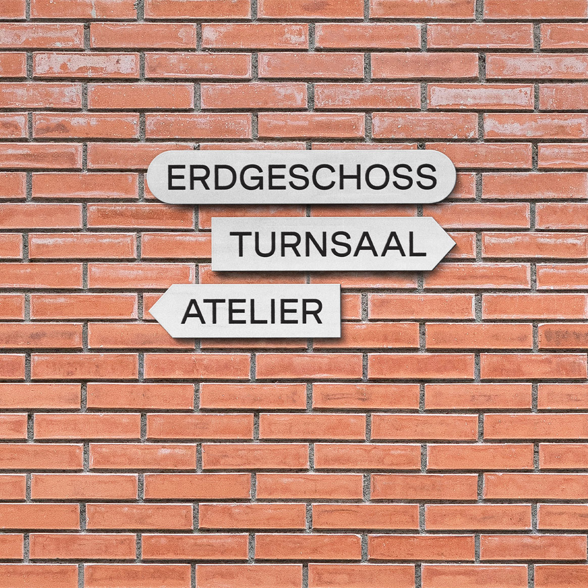
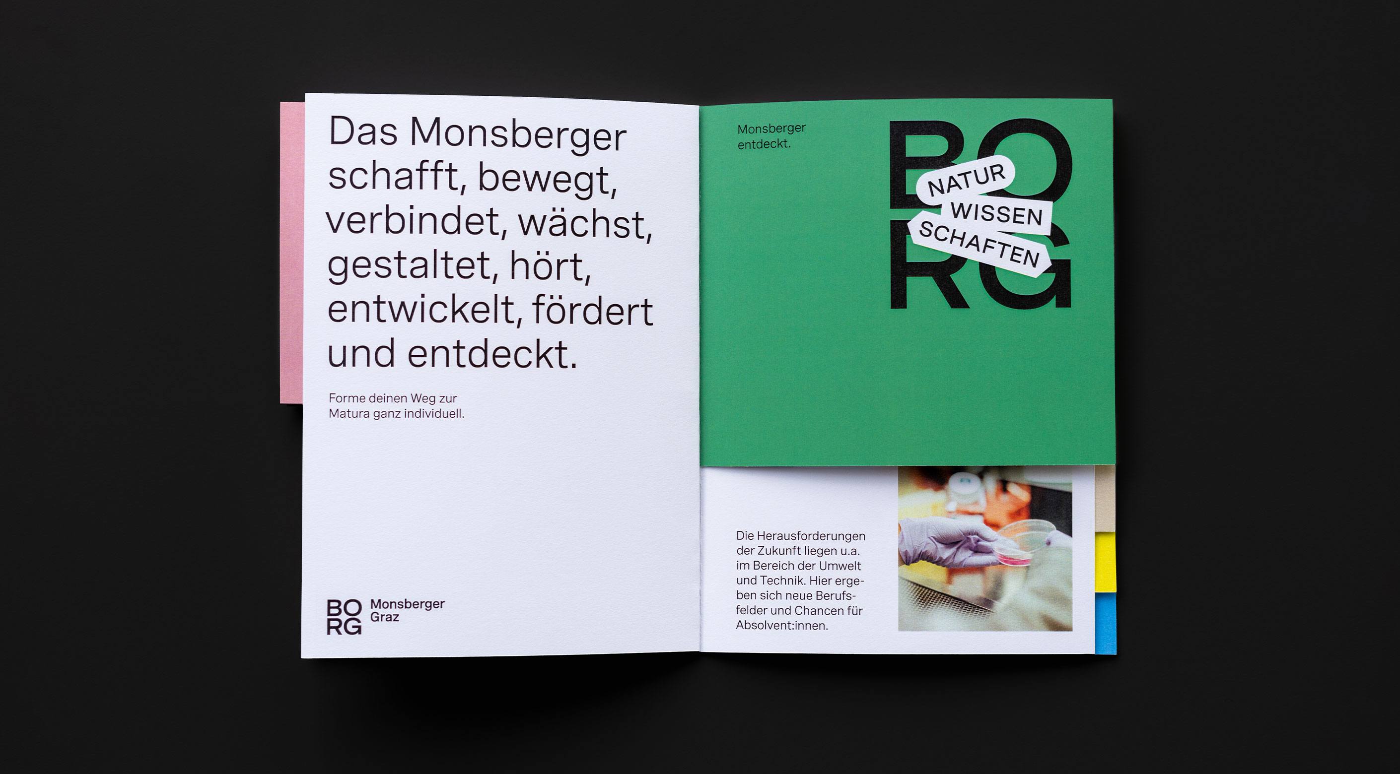
We designed a flexible logo system inspired by students’ individual journeys, with colorful shapes representing each study path. The word “BORG” serves as a foundation – like fertile ground for personal growth. A mint-green tone, derived from the school’s architecture, became the main color, complemented by a color system that groups similar areas into subject clusters (e.g. shades of blue for sports). A clean, timeless font paired with the color system creates a visual language that is modern, adaptable, and approachable. The school’s mission—“Dein Weg, deine Chance” (“Your path, your chance”)—captures this spirit of growth and opportunity.
The impact
The rebrand gave BORG Monsberger a modern and unified identity, strengthening its image both inside and outside the school. The flexible system empowers the team to apply and evolve the design independently, while supporting the core values: education, community, and the personal growth of every student.